
SBI Life
2024
Redesigning the insurance purchase experience to lower CAC and improve conversions
User Research
Funnel Audit
Competitive Benchmarking

OVERVIEW
As a Senior Designer, I conducted user research, behavioural analysis, audits, and benchmarking to identify opportunities — contributing to the redesign of the sales funnel and insurance purchase journey
Project
Redesigning the digital purchase journey of SBI Life to simplify a previously complicated and overwhelming process, aiming to improve conversion rates and reduce inefficiencies in lead management.
Challenge
The online insurance purchase journey posed significant hurdles for SBI Life. Potential buyers were frequently dropping off, leading to a high rate of abandonment and elevated CAC.
Process
Step 1: Research
To uncover the core problems affecting conversions and driving up CAC, we conducted in-depth research using the ‘4 Voices Model’ — capturing the voice of user, intent, experience, and design.
Step 2: Design Principles
Based on insights gathered during research, we established key design principles to guide all design decisions and ensure consistency.
Step 3: Purchase Journey Redesign & IA
We began with redesigning the purchase flow and built a detailed IA to ensure alignment with SBI Life’s compliance requirements and secure approvals before moving into detailed design.
Step 4: Wireframe & Designs
We then designed high-fidelity wireframes to define structure, layout, and user flow, collecting early feedback and ensuring alignment. Once approved, we started with UI exploration and interactions to deliver polished, development-ready designs.
Note: I was involved up to the finalization of wireframes and initial UI explorations; I transitioned to a new company before the final UI design phase.
Team


USER RESEARCH
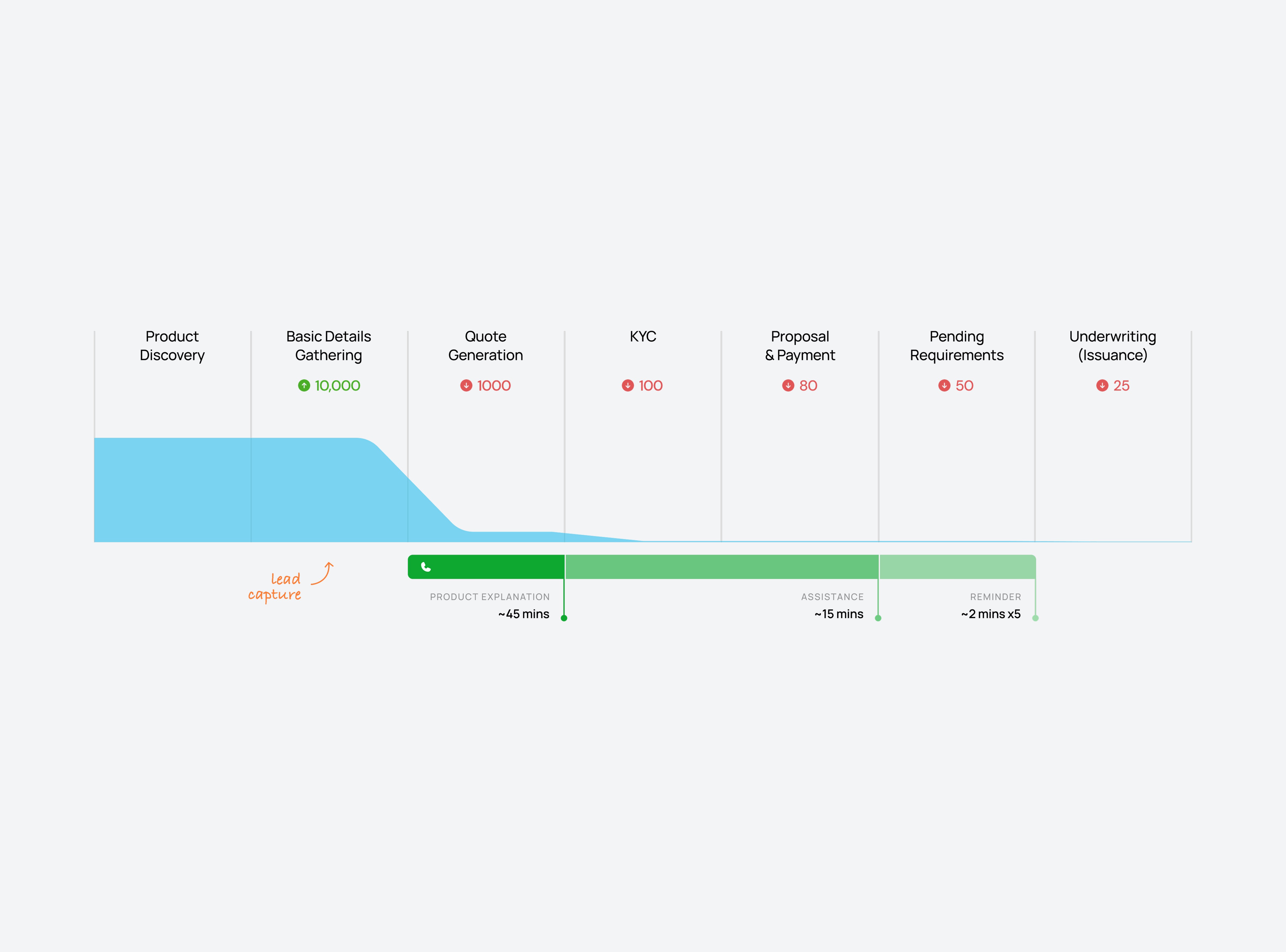
Getting people to talk about insurance was tough, so we analysed 50+ sales & support calls to understand their challenges.


Key Findings
During user research, we discovered that ~90% of high-intent buyers were dropping off because they felt unsure and confused about what to enter at the form-filling stage , not because of the long process.
We discovered that drop-offs spiked at steps that demanded more effort from users, like uploading documents or providing family and medical information
Poor communication of product benefits on the website was driving up CAC, as calls ran long with agents spending most of the time explaining them
COMPETITIVE BENCHMARKING
We studied 10+ competitors to decode what the industry gets right, and how SBI Life could do it better.


Best Practices
During our competitive benchmarking, some approaches stood out as unique and effective.
Each company showed distinct strengths and weaknesses in how they guided users, filtered leads, and organised information, offering valuable lessons and contrasts to our current process.

Acko Insurance
Acko provides a highly personalized, guided journey by asking users relevant questions before showing specific insurance options.
This approach helps reduce overwhelm for those exploring but can frustrate users who know exactly what they want, as they must still navigate a long series of questions.
Acko also explains why it asks for detailed information, which helps reassure customers and increase trust.

Max Life
Max Life stands out for its efficient lead filtration. It captures essential details up front (such as age, gender, and smoking status) and immediately filters out unqualified leads, saving both time and effort for the sales team and users.

ICICI Prudential
ICICI’s process is similar to Max Life but includes an extra layer: it channels ineligible users toward alternative products they may be qualified for, helping retain mid-intent customers.

Policy Bazaar
As an aggregator, Policy Bazaar adapts its journey to each insurance provider’s requirements.
Its well-organised information clusters set clear expectations and reduce anxiety about what lies ahead in the process.
SOLUTION - SALES FUNNEL 2.0
We revamped the entire Sales Funnel in a way that benefits both the buyer & business through strategic interventions
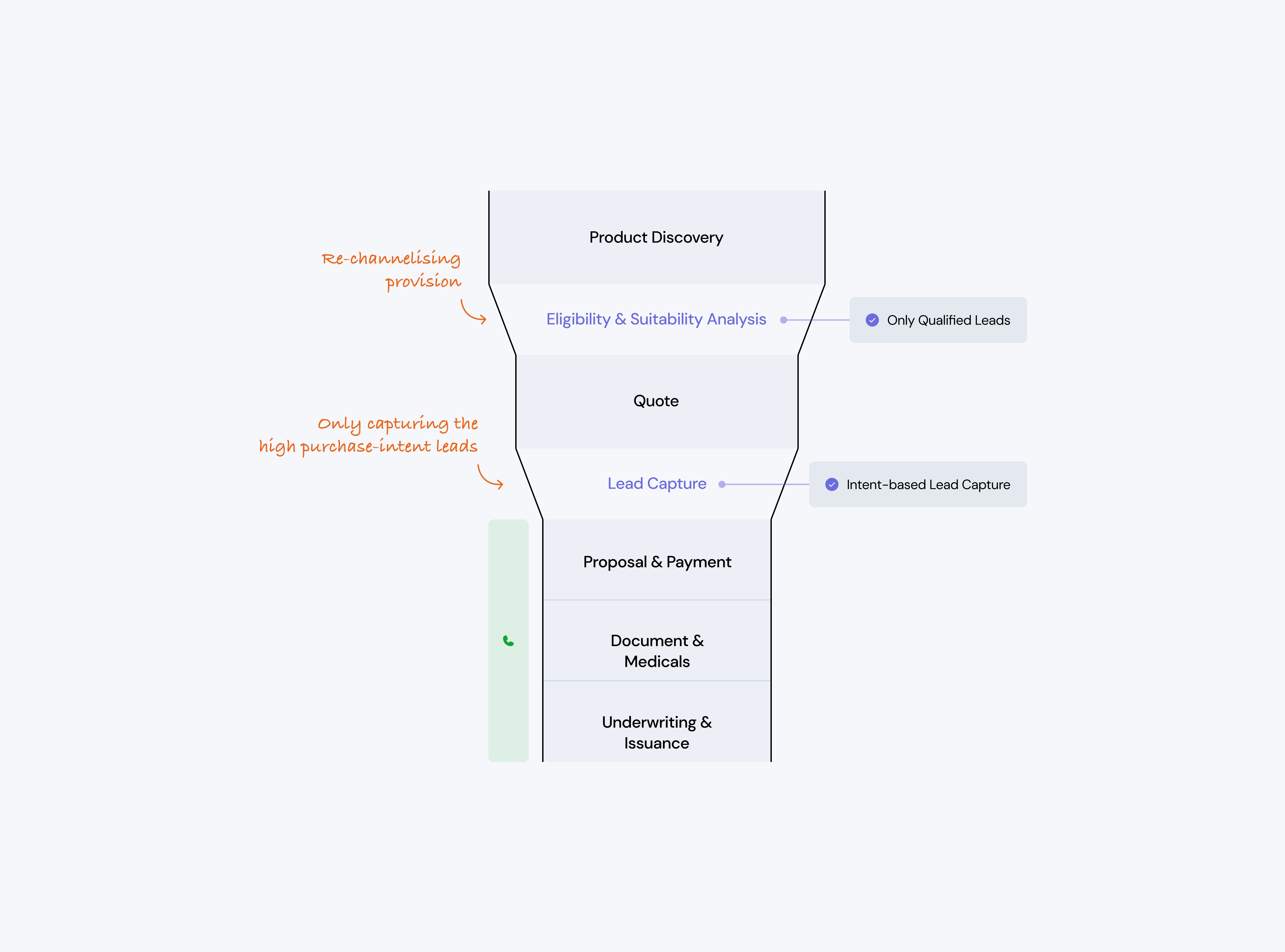
Sales Funnel 2.0
We redesigned the sales funnel with advanced features such as eligibility analysis, suitability analysis, lead
re-channellisation & strategic human intervention — each feature solving the core UX and business issue.
Introducing
Eligibility Analysis
During research, we noticed that certain combinations of user details and product parameters leads to guaranteed rejections later in the process.
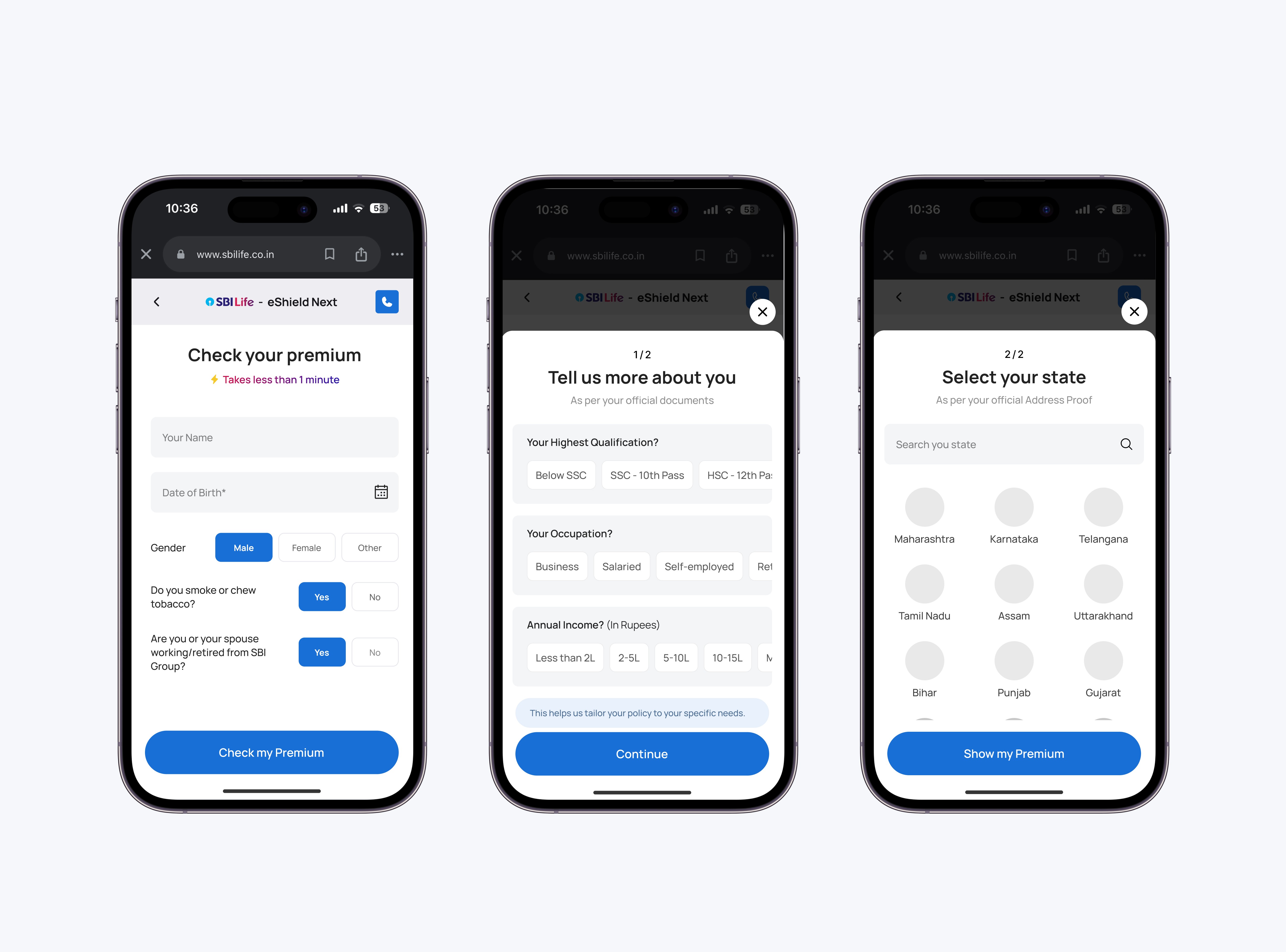
So we brought eligibility checks to the very beginning of the journey. We mapped every product’s disqualifying criteria and built an ‘Entry Form’ that captures only the key data points responsible for eligibility decisions to filter out ineligible leads right away.
This will help filtering out ineligible leads early, saving buyers from later rejections & let us redirect them to other products they’re eligible for.
To keep it simple and reduce cognitive load, the form was divided into 3 easy steps.
Strategic
Human Intervention
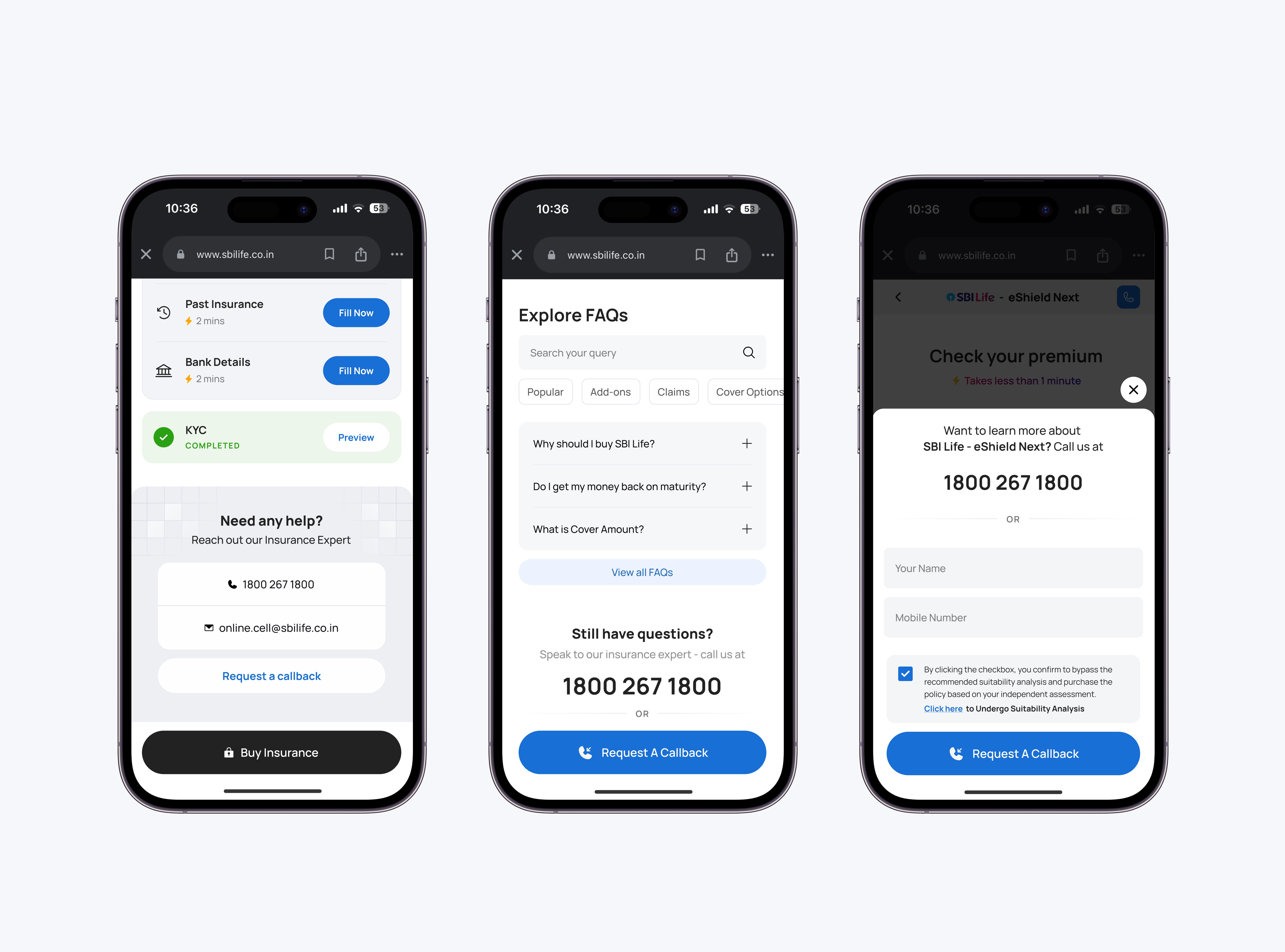
We moved the agent intervention after the Quote Page, once buyers have explored the product and reviewed their premiums. Earlier, agents reached out too soon, making interactions feel pushy.
Now, agents will engage at the right moment, leading to fewer calls, lower CAC, and higher conversions.
An option to reach out to an agent remains on every page, keeping help within easy reach whenever buyers need it.
DESIGN & INTERVENTIONS
Buying insurance online is a long & tedious process, we can't change that — but we can surely make it less overwhelming.
Simplified
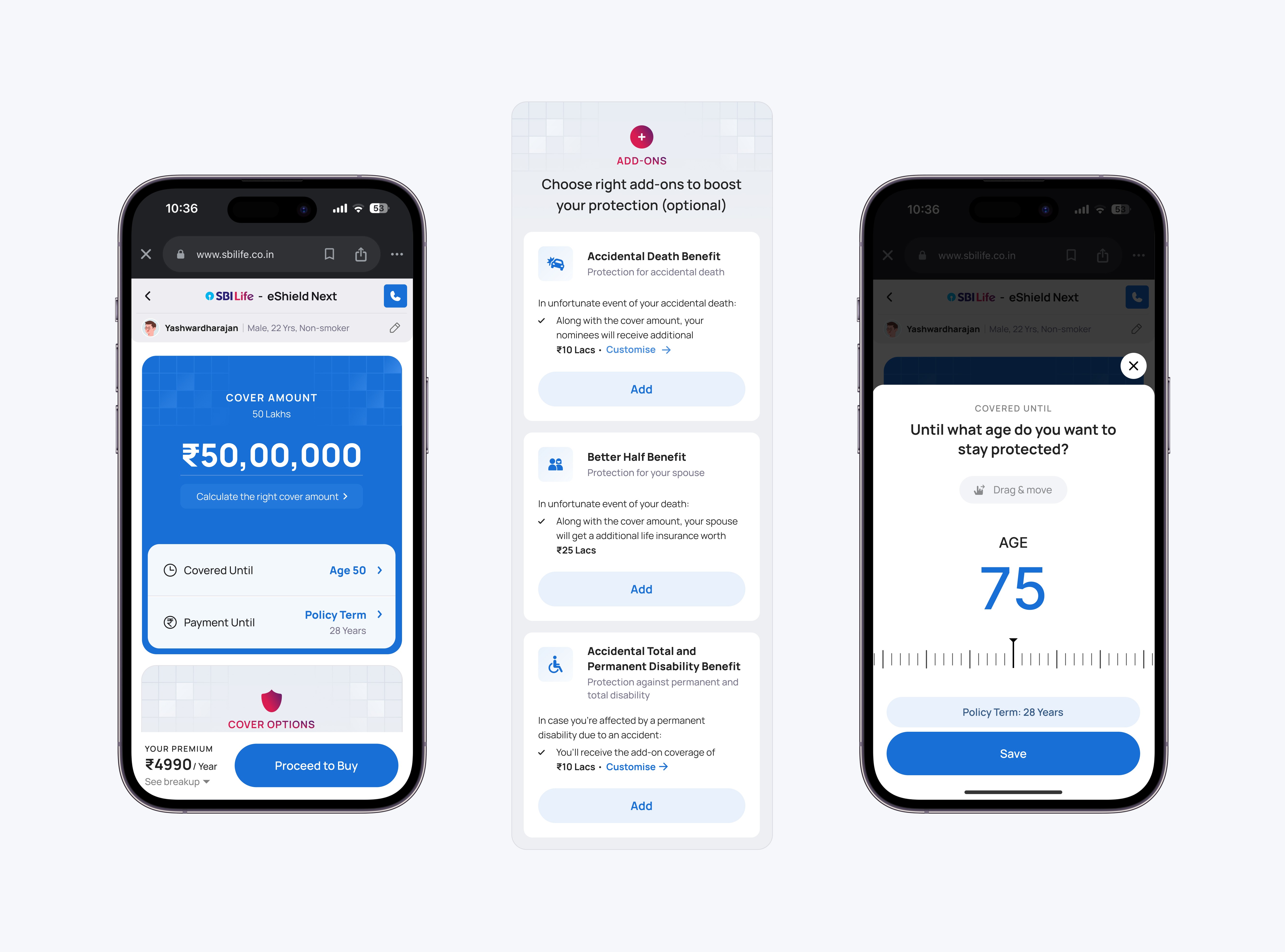
Quote Page
SBI Life’s analytics showed that nearly 90% of users dropped off at the Quote Page. Through research, we found that most buyers simply didn’t understand it.
People were confused by domain-heavy terms like Sum Assured, Premium Frequency, Policy Duration, etc. So,
we simplified the language — Sum Assured became Cover Amount, Policy Duration became Covered Until, Premium Duration turned into Payment Until, and so on.
Add-ons were another major source of confusion. Buyers often thought add-on benefits replaced the product’s core benefits. We made add-ons easier by simplifying the descriptions and using illustrative examples, making choices easier and more confident.
To make the experience more engaging, we introduced light, interactive input fields that made the Quote Page feel less like a form.
Introduced
Hub & Spoke Model
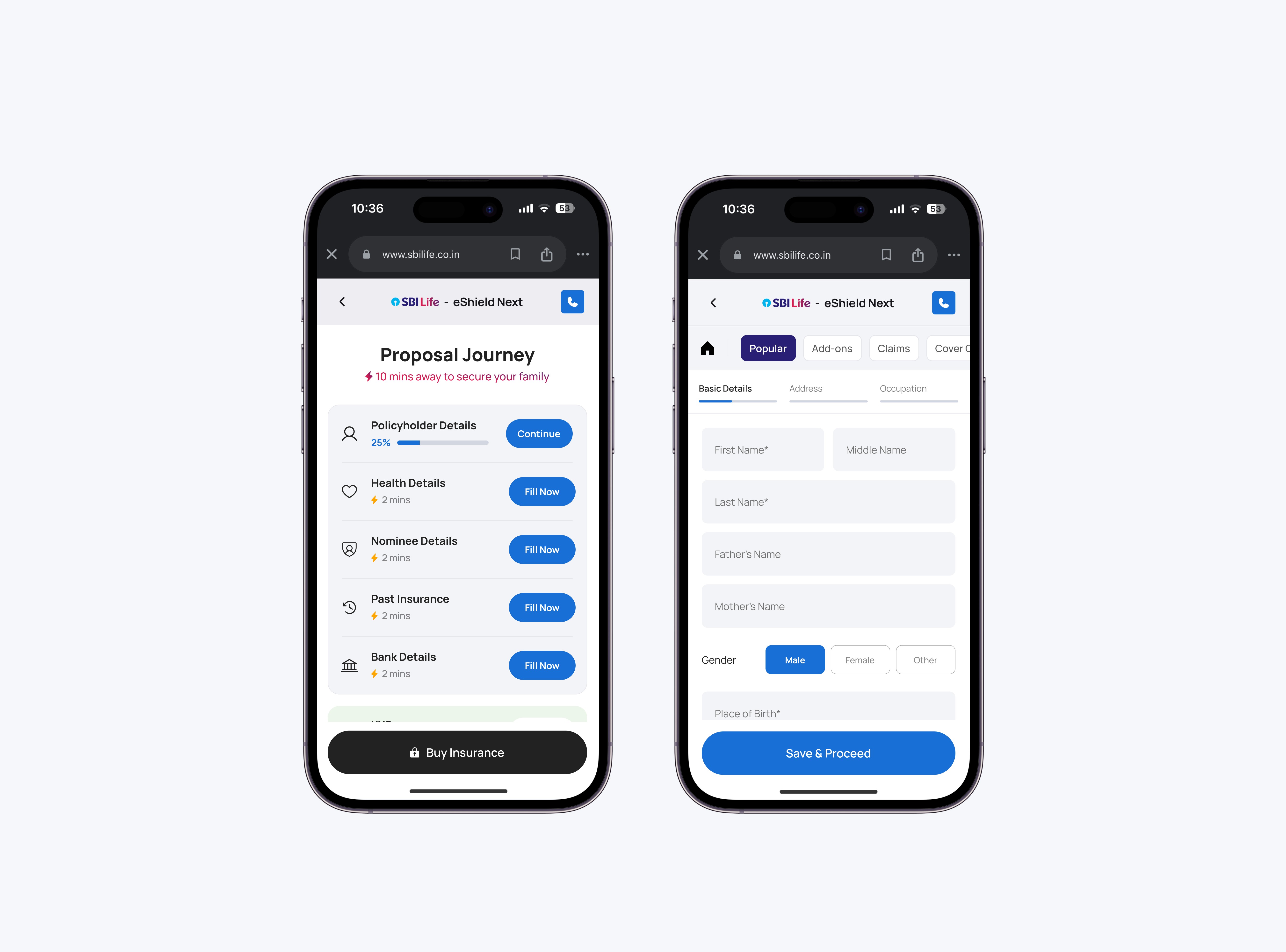
The form-filling stage was the longest and most effort-heavy part of the journey, and where most users got stuck. It was a rigid, linear flow where buyers couldn’t skip questions. If they didn’t have certain details handy, they had to drop off.
To solve this, we introduced a Hub & Spoke model and grouped related questions into sections, all accessible from a single hub. This made the flow flexible and non-linear, allowing users to fill in what they had and return later to complete the rest.
We also listed the required documents upfront in each section, helping buyers stay prepared and reducing friction throughout the process.
Life insurance penetration in India remains low, with only 34% of the population owning a policy and 47.6% unaware of term insurance and its benefits.
The traditional insurance purchase process is often complex and overwhelming, discouraging many from securing coverage.
This project provided me the opportunity to redesign the online insurance purchase journey, aiming to simplify the process and empower more people make informed decisions comfortably from home.
And that’s a wrap — hope you enjoyed it!
The End